#17 - Three Rules for Great Facade Design
In This Issue
Three Rules for Great Facade Design
Last week UrbanToronto announced its annual reader poll to select the best buildings of 2024. Some people have been critical of the nominated projects, basically complaining that these buildings are not very attractive.
You can take a look at the post and images below, and decide for yourself what you think about the architecture.
Personally, I think a few of these buildings are very nicely done. On the other hand, the critics kind of have a point.
New readers may not know that I trained and worked in architecture before I got into real estate development. This is a topic I know a little about, and care a lot about.
It’s not always fair to place the blame for an underwhelming design squarely on an architect — a typical project gets a lot of subjective feedback that needs to be incorporated, often making the design worse in the process. Regulatory processes like a Design Review Panel, consultations with the public, and reviews by city staff will almost always produce comments which are contradictory and cannot be ignored. An architect also faces a lot of pressure from the owner/developer to reduce the cost of a building facade. This usually makes the building less appealing.
Having participated on all sides of this process, I have had to make hard decisions about where to spend money in architecture, and how to make the most of a limited budget. So I want to share some of my own personal rules for how to create nice building facades without necessarily driving up the price.
These are little tricks I’ve learned over the years, which I use when developing initial concept designs for new projects. None of these ideas are my own inventions. They are principles that you will hear from many talented architects, and I think it’s worth rolling them up into a short list. These are not commandments, just rules of thumb. There are many great buildings which violate these principles. The goal is to present a few simple ideas which, if followed, will get you 80% of the way toward having a nice-looking building.
Rule #1 - Base, Middle, Top
This one is very simple. Compose your façade into three legible parts: a base, a middle, and a top. It’s hard to overstate the power of this rule. People love buildings that do this. Odds are many of your own favorite buildings follow this rule.
Here is The Baldwin, an affordable housing project that I built in Washington, DC for Insight Property Group. The designer was Maurice Walters Architect. It looks pretty traditional from afar, but the details are very fresh when you get up close. This building has a clear base, middle, and top.
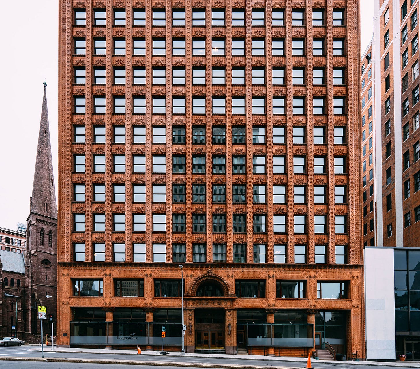
This principle applies just as well to larger buildings. Here is the magnificent Guaranty Building, an early modern skyscraper in Buffalo, NY by Louis Sullivan.
This rule also works on buildings which are more formally complex, like Chicago’s Carbide and Carbon building by the Burnham Brothers. (You can actually read this one a couple of different ways, with the “top” being only the top few floors with gilded detailing.)
Even a very minimalist design can benefit from this kind of visual organization. Look below at the difference between two iconic Toronto buildings, the West Tower of the Bay Adelaide Centre by WZMH and the Toronto-Dominion Centre by Mies van der Rohe. Bay Adelaide is very nice due to the quality of the curtainwall glazing and the folded treatment of the corners, but one thing always catches my eye: it just sort of stops at the highest floor, with a sheet of glass floating in the air — there is no defined “top”. I think it would feel more complete with some kind of top or a frame to enclose the glazing. Note how the mechanical penthouse and steel corners of the Mies building give it a more muscular, firm presence.
Rule #2 - Easy To Sketch
Start your design by making it highly ordered, and then deviate when it makes sense. This is much easier than starting with something that is disordered and then trying to make it look nice. Highly ordered just means that the various parts of your building follow patterns which are easy to read (i.e. the patterns are “legible”).
Here’s a photo of the Arthur Meighen Building in Toronto, which Alex Bozikovic critiqued in this excellent article. Notice how some of the vertical panels align, and others don’t. There are also multiple shades of beige tile, in a pattern that isn’t consistently followed across the building. The pattern and color choices feel a bit random. The larger clear glass opening (which I think follows an interior stair) isn’t clearly demarcated except by small mullions and light cannot bypass the slab edges, which makes the boundary a little hard to read under most light conditions.
All of these decisions gives the façade a jittery feeling that I find visually unsettling.

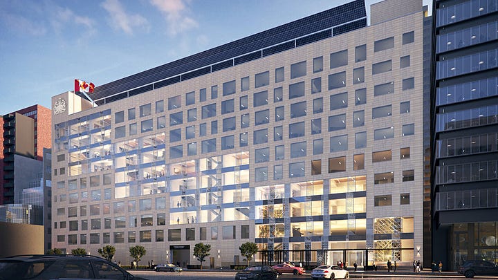
Jittery facades are everywhere in contemporary architecture. They tend to have relatively little legible order.
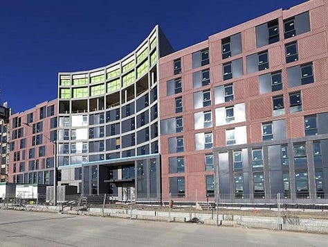
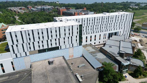
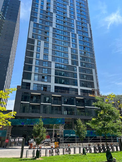
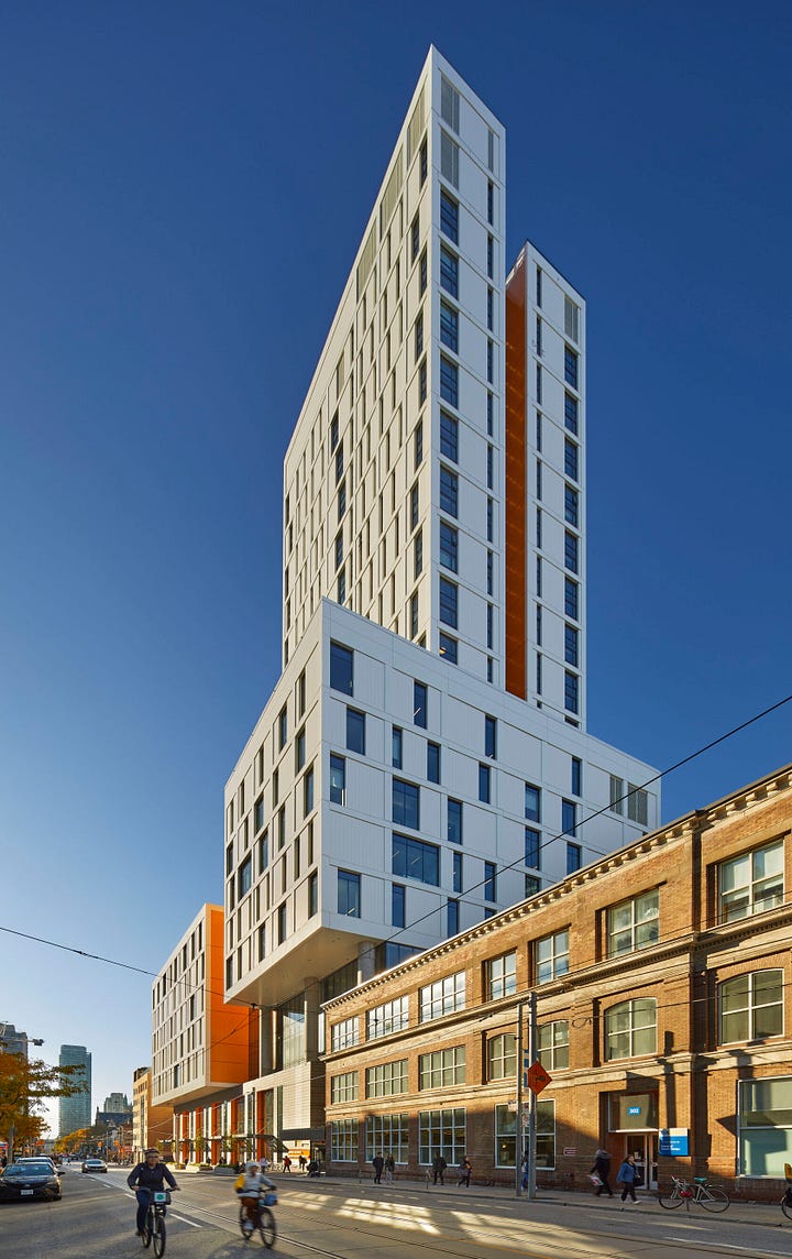
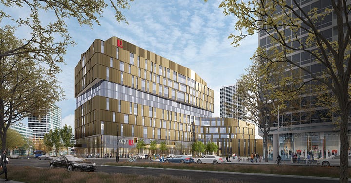
I think architects do this because it’s an inexpensive way of adding variety to a panelized facade that might seem relentless if it were just the same module repeated hundreds of times.
But a repetitive motif only feels relentless if it’s not delightful. Here are two examples of very repetitive facades.
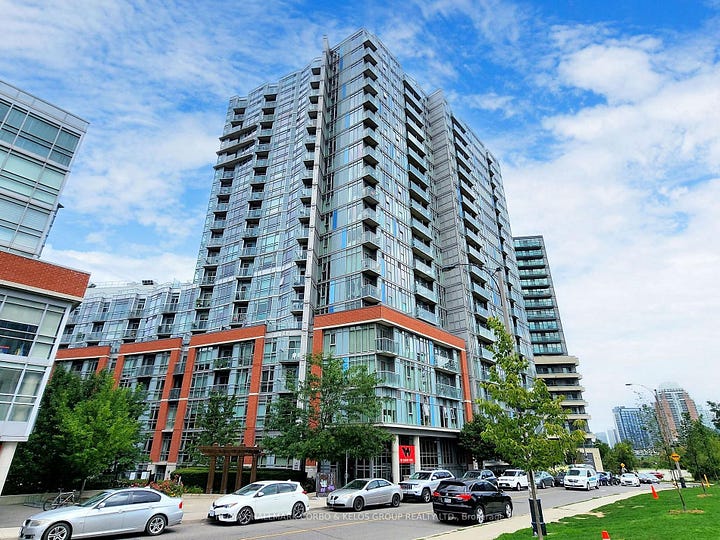
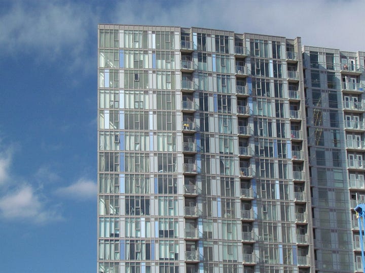
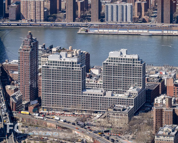
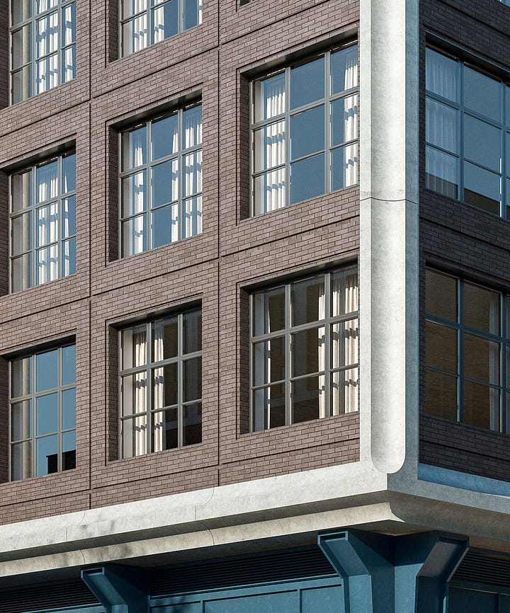
In my opinion, 150 Sudbury feels a bit disordered and Front & York looks very tight. The difference is that the glass building has very irregular patterns that are determined by window wall mullions and solid spandrel panels that reflect interior layouts. This pattern repeats in one direction — vertically. Because it’s all glass, with very little regular order in the glazing pattern, the interior window treatments tnd to dominate how the building looks. The second project has a hierarchy of visual elements (consistently sized windows, a brown brick field, and a precast frame). These elements repeat in a legible pattern across two dimensions to create a composition. Even with irregular window treatments, it feels very orderly.
Here’s a useful heuristic for assessing a building façade: If you looked at the glass building for an hour, you might still struggle to sketch it from memory with much accuracy. You could probably sketch the second building after looking at it for less than a minute. That is how highly ordered it is.
Rule #3 - Keep The “Big Moves” Simple
Many of the most cherished buildings in the world have a hierarchy of complexity that looks something like this:
Let’s look at some examples. Here is the Guaranty building again. Note that the “big move” (i.e. the overall form of the building) is extremely simple. It’s a great big box.
When you zoom in on the first few floors, you notice that there is a lot of depth to the facade that creates visual interest using a simple pattern. There are two intersecting planes: a vertical plane between the windows, and an inset plane that forms the spandrels below each window. Structurally it’s pretty simple but wow, it looks amazing.
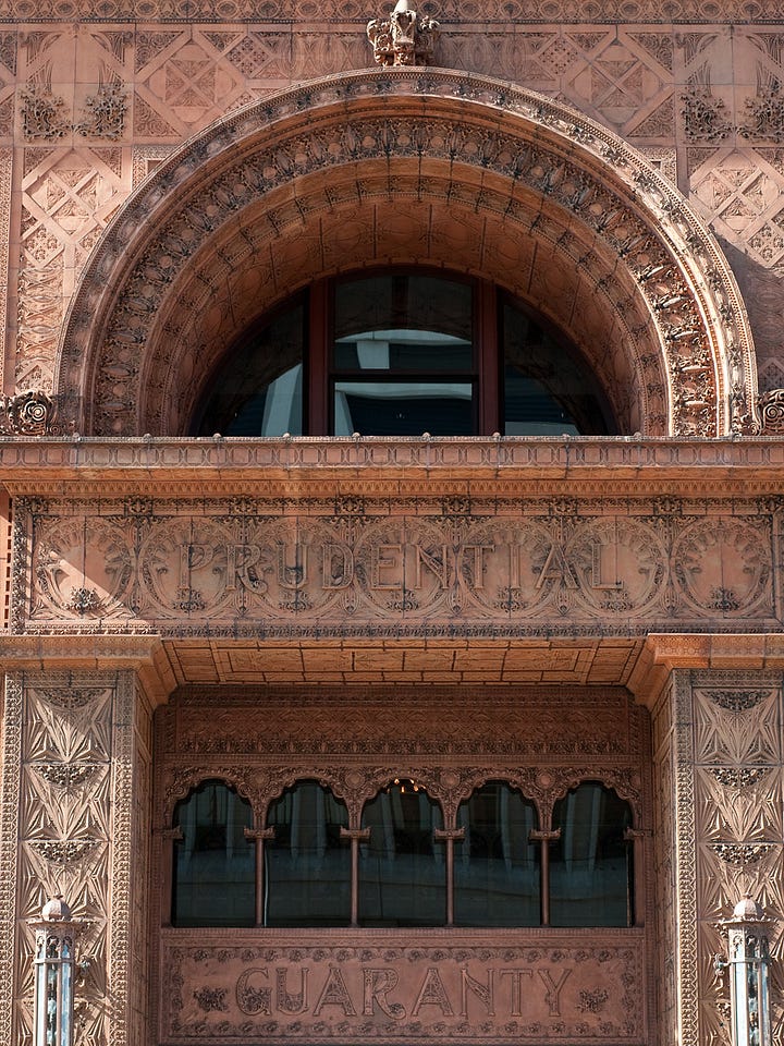
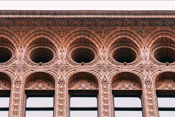
Zoom in again and you can see the rich detailing of the panels. These are industrially made, and therefore easily repeated across the entire building. But the cumulative effect really pops. And the details are fully resolved — you don’t notice any awkward joints, tiles cut at odd dimensions near interior corners, or random pieces of flashing sticking out. 10/10.
One criticism I often have of contemporary architecture is that it often inverts this hierarchy. The big moves are very complex, requiring lots of coordination between consultants and contractors, for not much payoff. For example, people don’t see buildings from a birds-eye view, we see what’s closest to the ground. Many contemporary projects spend their resources on big moves that people won’t notice, and then when you zoom in on the human-scaled details, they feel a little spartan.
Below is Aquabella, an impressive project here in Toronto by Hines and Tridel. They made some bold moves when it comes to building form, and the construction quality is quite good. But the photo below is the main entrance, and you could be forgiven for walking right by it. There is very little attention apparent in the details of the canopy, entry doors, and podium windows compared to the complex building form.
And this is a really good team! Hines is one of the best developers in the world, Tridel is one of the best builders in town, and the design architect 3XN is world-renowned. So this isn’t a criticism of these players in particular, it’s just the way that projects tend to be designed these days.
I anticipate that some people will disagree with me on these principles, and that’s okay. It would be great to hear other perspectives, so feel free to leave a comment or reply to this email.
Business Updates - 2024 Year In Review
How I Spent The Year
Consulting. In 2024 I accepted more third-party work. This has been positive — it kept me busy and more plugged into the market while I continue to work on my own pursuits. Imprint completed several engagements last year, working with private lenders and developers to reposition sites that were struggling to find construction financing. A couple of these are ongoing as we head into 2025.
Raising Money. Last year I built out my list of investors for new opportunities, both large and small. This task is never finished, but I’ve gotten to a place where I could probably raise enough capital for at least one rental project without needing outside help.
Recovery Capital. This year I quietly launched Recovery Capital, a platform dedicated to rescuing distressed development projects. We provide capital and management expertise to lenders, receivers, and developers who can’t advance their projects for any number of reasons — a weak market for condo presales, inexperience in rental development, lack of liquidity, ongoing loan defaults, or unsatisfactory bids received from a court-ordered asset sale. With luck, I will have more news about this in the coming months.
Lessons Learned
#1 - Benefits of Consulting. During my first year in business, I didn’t make much revenue. This was a conscious choice; I turned down a few consulting engagements that would have brought in development management (DM) fees. As long-time readers will know, this is because I didn’t want to spend all of my time working on other people’s deals; I was focused on getting my own sites under control. As it turned out, all of the deals I tried to acquire during this period fell through.
In hindsight, I should have been a little less dogmatic about this. I always said I would accept this kind of work if I felt there was a good reason, but I probably declined more work than I needed to. This kept me from working on projects where I would have made new connections, and where I would have gained more direct insight into what’s happening in the market — be it planning policy, construction pricing, capital markets, etc.
Another benefit of doing DM work is building up a reputation. Imprint’s strength, relative to its competitors, is excellence in project management and rental operations. Actually running projects is a way to build a track record and demonstrate how you work to clients, investors, consultants, and local government. I don’t think I considered this enough during my first year in business, and thought I could rely more on my CV.
#2 - Marketing. Real estate development can be more restrictive than other sectors when it comes to sharing information. You don’t want to broadcast your plans too early, for lots of reasons. When working on distressed projects, you are in the middle of very sensitive situations and it’s especially important to maintain confidentiality and confidence. This problem will resolve itself over time, but for now I need to be strategic about marketing. I can’t share projects on my website, for example, and need to rely more on word-of-mouth.
In 2025 I will be running a few business development experiments, including paid advertising and targeted email/social media campaigns.
The Year Ahead
I am excited about 2025. There are a few promising projects and partnerships in the works. My goals are:
Triple my revenue. This should be achievable, given some of the opportunities I’m working on today.
Bring on two or three more large investors for Recovery Capital and Imprint.
Start building out the Imprint team, once we have the equivalent of two active, full-time development applications ongoing.
Advance two projects to the point where I can openly share them here.
That’s a wrap.
I write this newsletter because I like to connect with smart people who are doing interesting things. Feel free to reach out with questions or suggestions by replying to this email.
Thank you for reading. Wishing you all a prosperous year.


